
5 Signs Your Website Is Hurting Your Sales
Is your website losing you customers? Here are five clear warning signs — and exactly how to fix each one to recover lost revenue.
Structured like an editorial page, with a cleaner reading flow instead of repeated card blocks.
Your website is supposed to be your biggest sales asset — not your biggest weakness. In today’s digital world, customers judge your business within seconds of landing on your website. If your website fails to impress, engage, or guide users properly, you are not just losing traffic — you are losing sales.
Many business owners assume that having a website is enough, but the reality is very different. A poorly designed or poorly optimized website can silently kill conversions without you even realizing it. In this guide, we will explore five clear signs that your website is hurting your sales and what you can do to fix them.
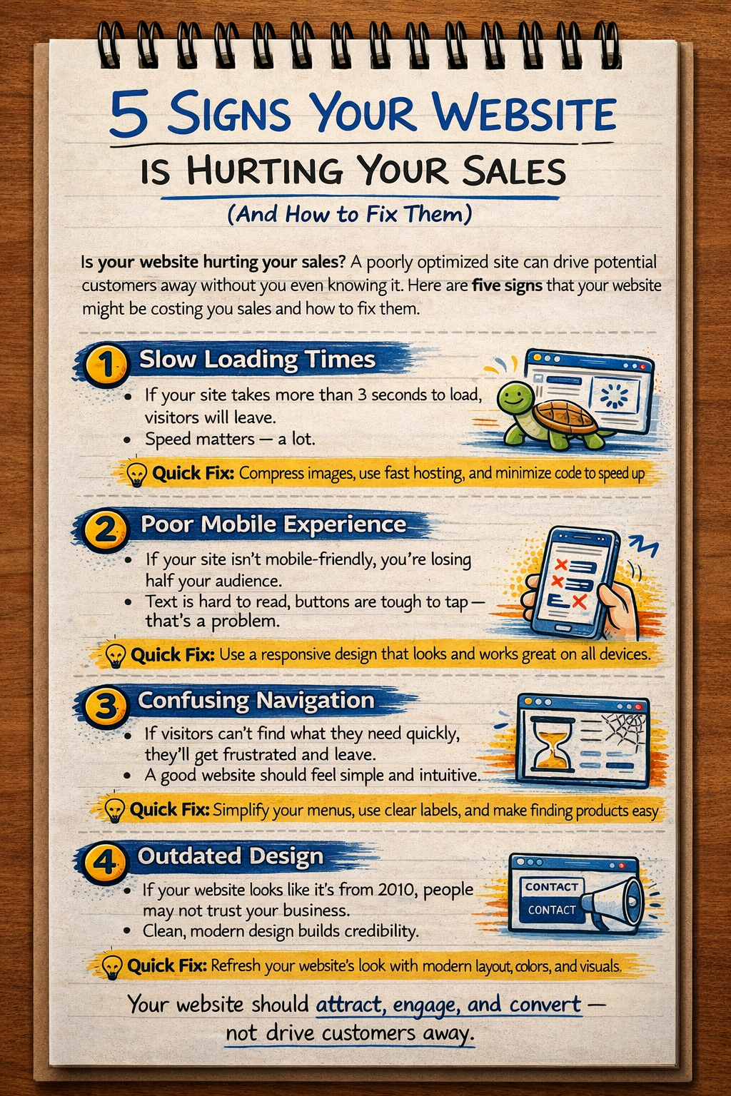
The first and most common sign is slow loading speed. If your website takes more than a few seconds to load, users will leave before they even see your content. Speed directly impacts user experience, SEO rankings, and conversion rates. A slow website creates frustration and reduces trust. To fix this, optimize images, reduce unnecessary scripts, use caching, and consider a fast hosting solution. Performance is not optional — it is essential for growth.
The second sign is poor mobile experience. Today, the majority of users browse websites on their smartphones. If your website is not responsive, users will face issues like broken layouts, small text, and difficult navigation. This leads to higher bounce rates and fewer conversions. A mobile-friendly website ensures that users can easily browse, search, and take action regardless of the device they use.
The third sign is confusing user interface and lack of clear call-to-action. If visitors do not know what to do next, they will leave your website. Too many options, unclear buttons, or cluttered design can overwhelm users. Your website should guide users step-by-step toward a specific action, such as making a purchase, signing up, or contacting you. Clear and visible CTAs like “Buy Now,” “Get Started,” or “Contact Us” can significantly improve conversions.
The fourth sign is lack of trust signals. Users are cautious when interacting with new websites. If your website does not show credibility, visitors will hesitate to make a purchase. Missing elements such as reviews, testimonials, secure payment badges, contact details, and company information reduce trust. Adding these elements helps build confidence and encourages users to take action.
The fifth and final sign is poor SEO and low visibility. If your website is not optimized for search engines, potential customers will never find you. Even if your product or service is excellent, lack of visibility means lost opportunities. Proper SEO, including meta tags, keywords, and structured content, ensures that your website appears in relevant search results and attracts organic traffic.
In addition to these five signs, it is important to continuously analyze and improve your website. Use analytics tools to understand user behavior, identify drop-off points, and optimize accordingly. A data-driven approach helps you make better decisions and improve your sales performance over time.
In conclusion, your website plays a critical role in your business success. If it is slow, confusing, unresponsive, or invisible, it can seriously hurt your sales. By identifying these warning signs early and taking the right steps to fix them, you can transform your website into a powerful sales engine. Remember, a great website does not just look good — it performs, converts, and grows your business.
Article gallery
5 Signs Your Website Is Hurting Your Sales visuals from the admin gallery
Need this done properly
Build, performance, SEO, and content can be handled in one delivery flow.
If you are planning a business site, technical blog, or product build that needs to look sharp and rank cleanly, the same approach can be applied to your stack.